
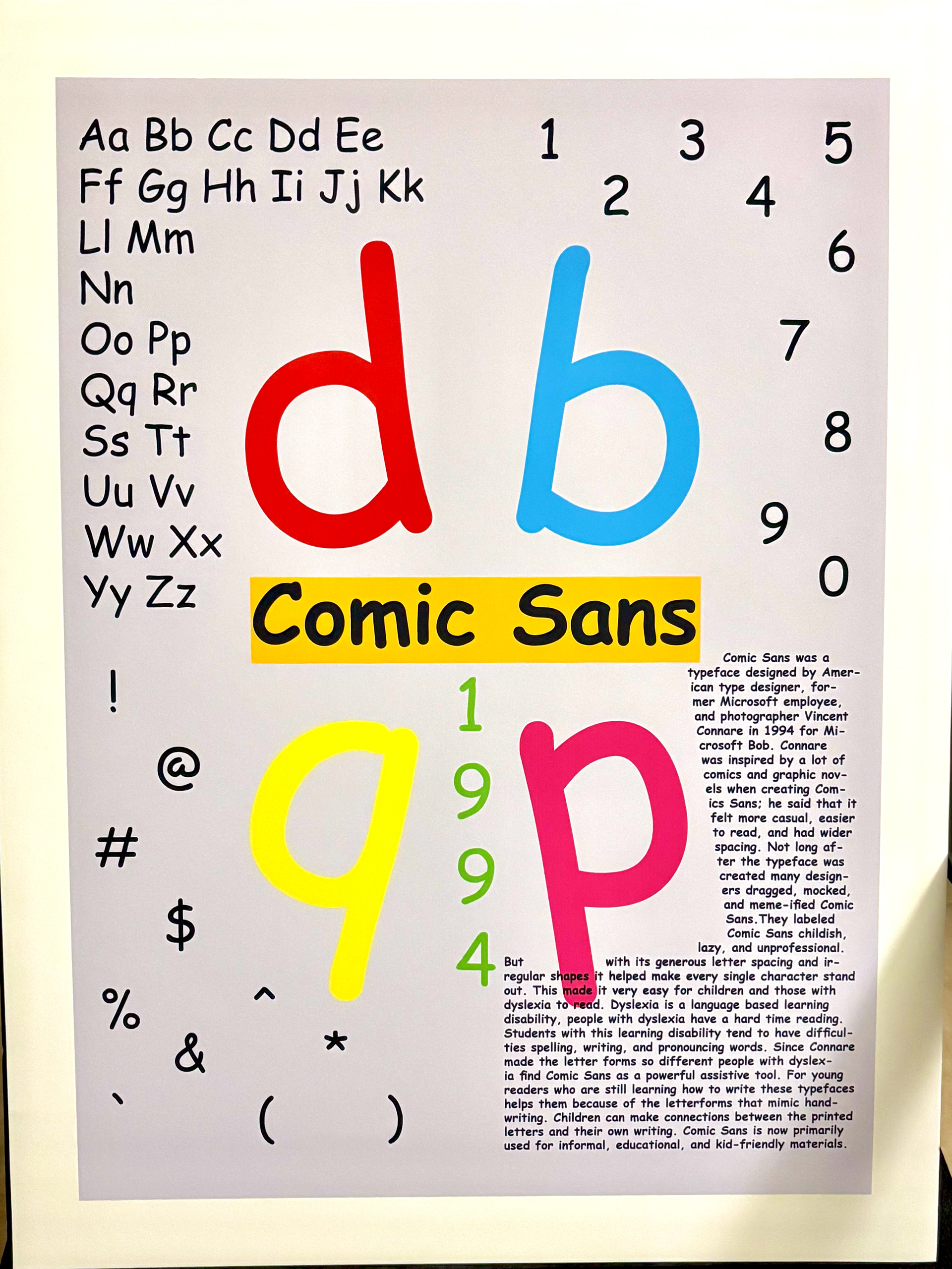
The History behind Comic Sans...
-Designed by Vincent Connare in 1994.
-Was Designed for Microsoft Bob but released in main Microsoft package in 1995.
-Its generous letter spacing and irregular shapes helped make every single character stand out.
-Helped those with dyslexia.
-It sticks because it’s highly legible.
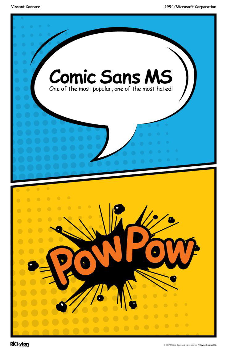
Inspiration
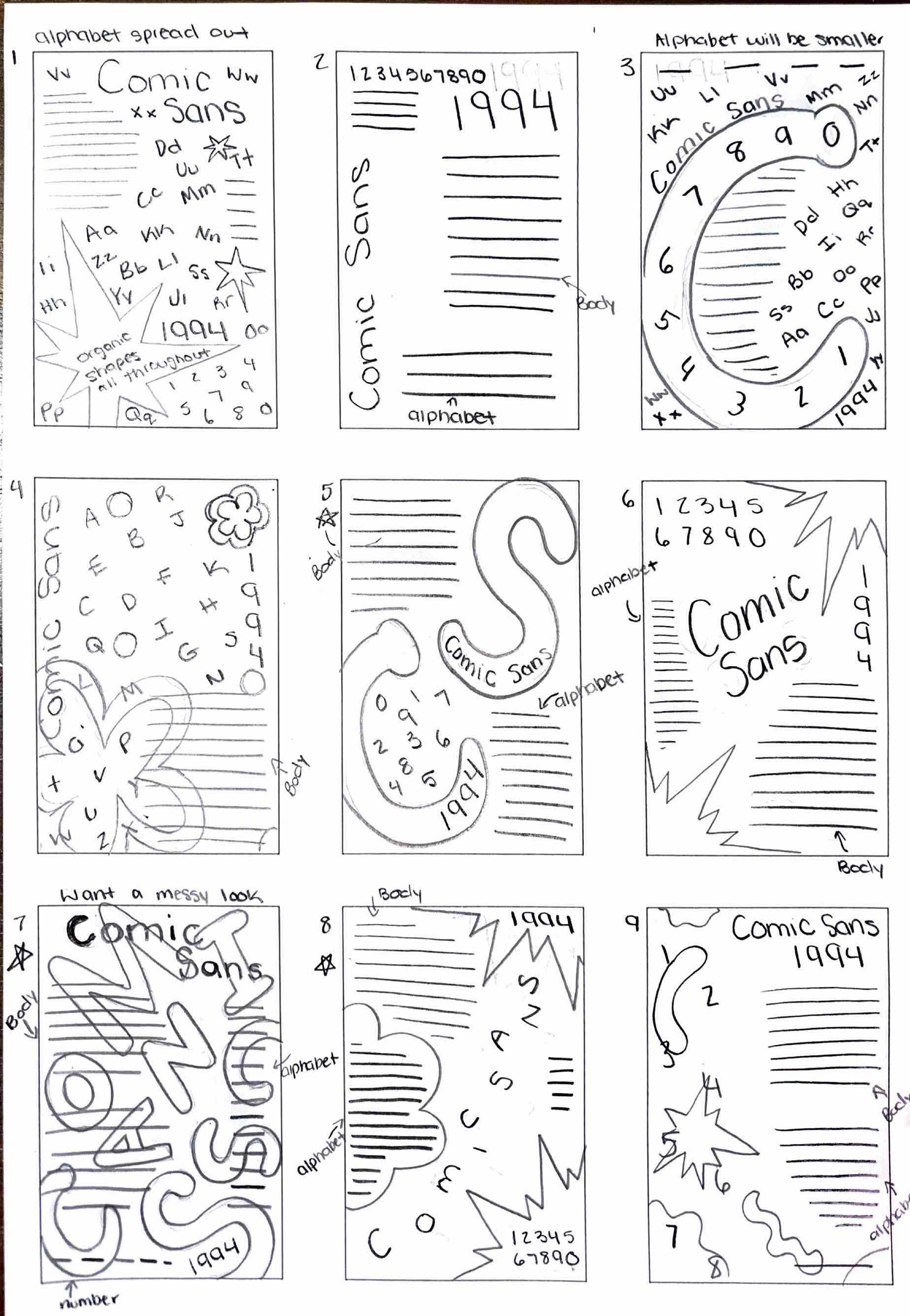
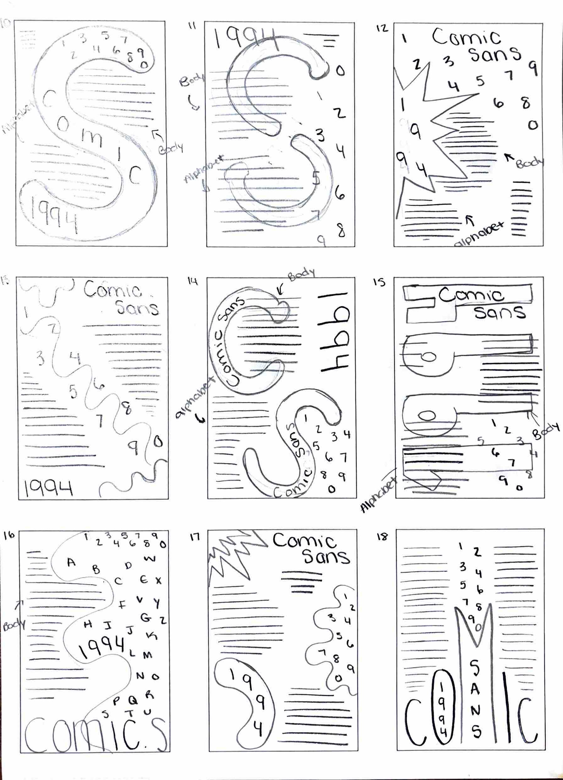
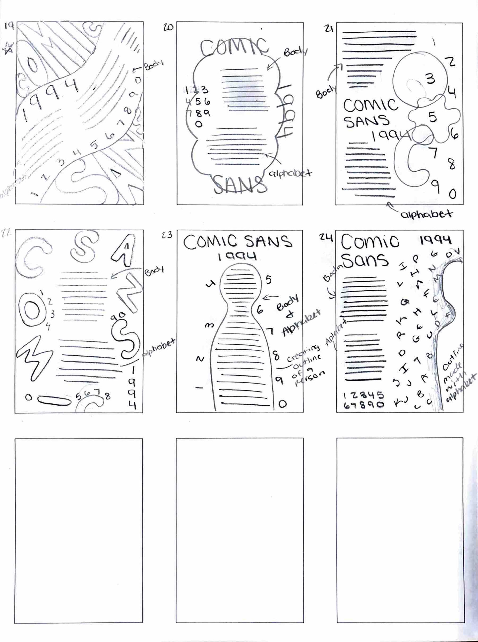
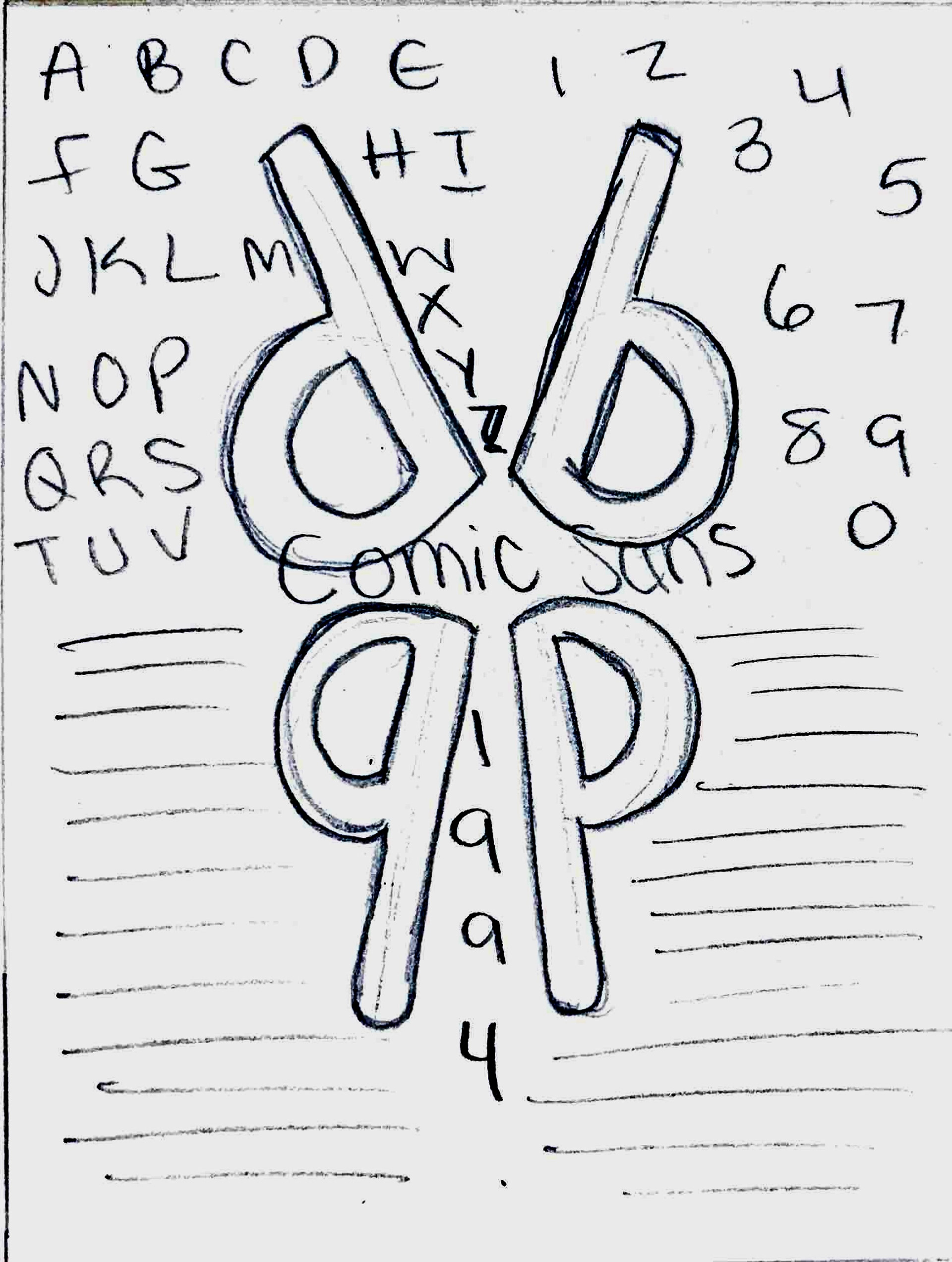
Thumbnails
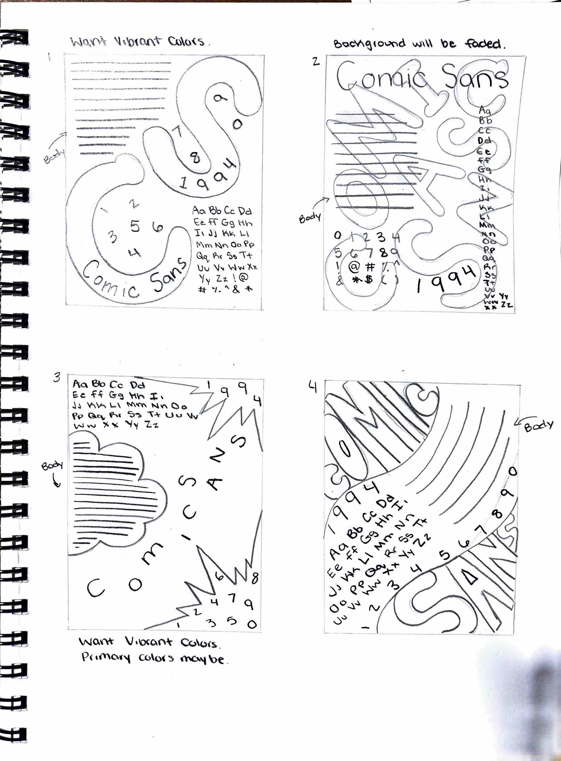
Final 5 Roughs
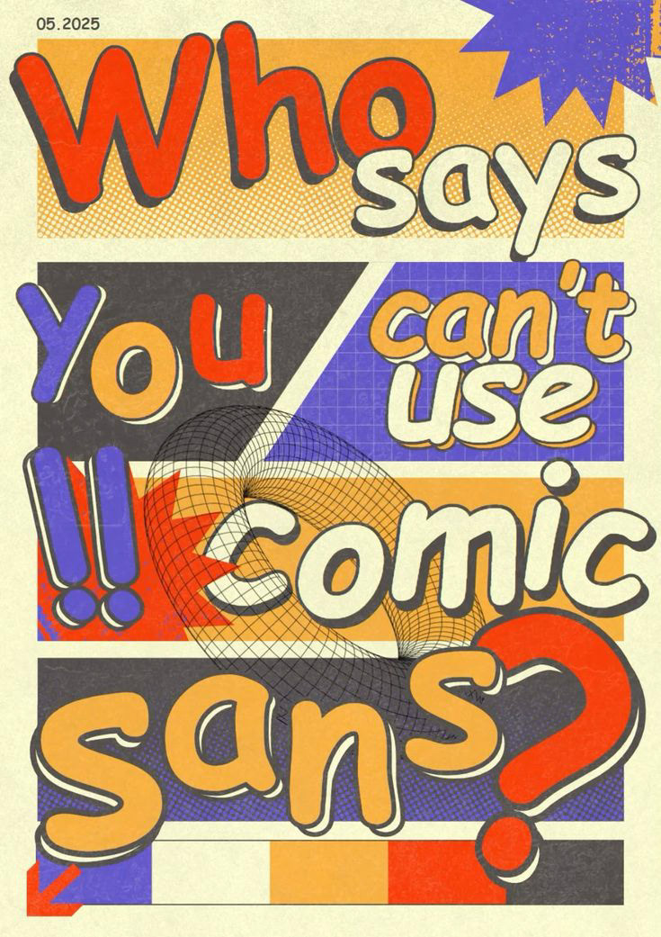
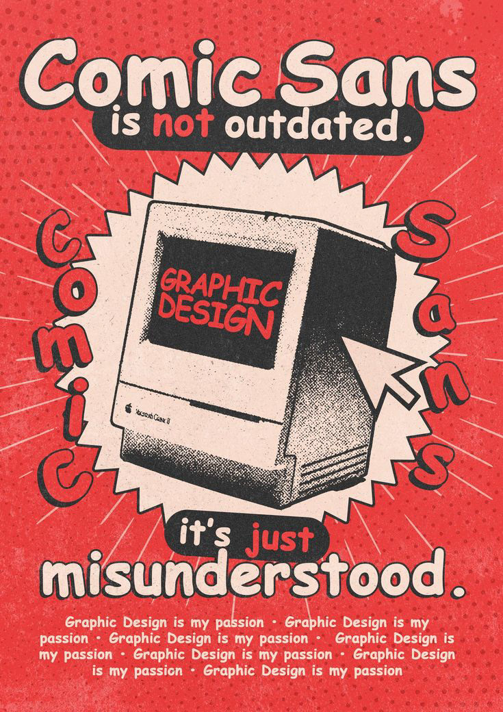
Final Poster
Reflection and Takeaways
What I learned about type history and design is that typefaces weren’t just made to use whenever but they were each designed with a purpose. Typefaces have reasons why they are the way the are for example, Comic Sans being highly legible which helped a lot of people that have dyslexia. How this project influenced my approach to typography was making me more curious on the purpose of every typeface. Now when I look at typefaces I always wonder what makes them different from the other typefaces.